
药明合联XDC品牌焕新
药明合联是全球领先的开放式、一体化生物偶联药CRDMO服务和技术赋能平台。药明合联在上市前夕,决定对其LOGO进行升级以提升品牌在全球范围内的卓越形象。我们在短时间内迅捷反应,对其视觉系统进行全面焕新。
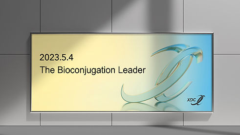
XDC is a global leader in bioconjugation. Ahead of its IPO, the company sought a logo upgrade to elevate its global brand presence. We responded swiftly, delivering a comprehensive refresh of its visual identity within a short timeframe.


我们与客户一同制定了项目目标:新的Logo应保持原有Logo的辨识度,提升美学观感的同时体现药明生物与药明合联的品牌关联,并避免与现有医药品牌的商标冲突,能够展示公司核心价值、气质和独特性。新的Logo从比例、粗细、颜色和构成进行优化,调整了字体、颜色、斜度和特征以保持品牌一致性。XDC中的X斜度既与药明生物梯子结构一致,同时上缘延续了旧版“耦合物”概念:
-
蓝色 代表 创新驱动力
-
绿色 代表 可持续发展行动力
-
碳黑色 代表着行业领导力
通过现代化的设计语言,新的Logo传递药明合联全球化的品牌影响力:不仅象征着全球合作的美好意愿,更是共同推动生物制药领域的发展与创新精神。
We collaborated with the client to define clear objectives for the new logo: maintain recognition of the original mark, enhance its aesthetic appeal, reflect the connection between WuXi Biologics and WuXi HL, avoid conflicts with existing pharmaceutical trademarks, and express the company’s core values, character, and distinctiveness.
The redesigned logo was optimized in proportion, weight, color, and structure. Typography, color, slant, and features were carefully adjusted to ensure brand consistency. The X in XDC aligns with WuXi Biologics’ ladder motif, while the top edge carries forward the concept of the previous “conjugate” design.
-
Blue represents innovation-driving momentum
-
Green represents sustainable action
-
Carbon Black represents industry leadership
Through a modern design language, the refreshed logo conveys WuXi HL’s global brand influence—symbolizing not only a spirit of international collaboration but also a shared commitment to advancing innovation in the biopharmaceutical industry.